
Contact Us
We’re here to help, so hit us on any of the channels below or scroll on down for the contact form.
BARCELONA BOATS Email
san sebastian surf Email
Phone
Everything Else
BARCELONA BOATS WhatsApp
SAN SEBASTIAN SURF HOUSE WhatsApp
Social
Let’s Talk Rebrands: An Open Letter From Gravy, Stoke Travel CMO
Stokepedia
This feels like a terribly self-indulgent thing for me to do – you know, who cares about what the piddling CMO from a middling youth travel company has to say – but rebrands are momentous moments in a brand’s history – given their occurring only when a brand is making a pivot, and act as trail markers in the brand’s history – and as such deserve, if not demand, some explanation.
So here I am. Gravy. Stoke Travel’s first surf instructor back when we were Smashed Travel; brand manager from when we reinvented as Stoke back in 2008, and now as CMO I’m proud to present this V.3 iteration of Stoke Travel to you and to a new generation of young travellers, thrill seekers and hedonists.
So why the change? And why now?
One thing we’ve always cherished and cultivated is a strong brand identity. Something memorable for better or worse. An honest youth travel brand. Cheeky – maybe sometimes a little crass, but always fun.
Due to our position as the upstart underdog brand, we’ve never been overly concerned about parents and partnerships, and this has allowed us to create a brand identity that really speaks to the experiences of young people travelling Europe. We’ve never had to completely ignore the sex, drugs and €2 baguettes reality that for many punctuates their exploration of the Old Continent; while we’ve never actively spruiked it – as this would be indecent, cringe and careless of us – we’ve been able to offer a little nudge and a wink to what travellers were encountering on the road.
And for that reason our previous logo made sense. For those of you unfamiliar with said logo, here it is in all of its kind of inappropriate glory.
![]()
Cheeky. Provocative. And yep, they’re my feet. The intimate details of how this came to be our logo aren’t necessary in this forum, but I can divulge that our first collection of tents couldn’t accommodate my full length (1.95m), and that an industrious surf camp manager/passionate photographer was up and cleaning the previous night’s party detritus and just so happened upon the visage of me and a bunk buddy stretching into the field, snapped the photo, and when we were developing the previous brand identity we decided that it would make for a perfect logo.
Its ability to make travellers look twice, provoke thought and conversation made it a memorable logo for us at that time, and it served us well as we made our way through our ratbag years. This was the time when it was our unstated aim to be banned from the advertising pages of TNT (London-based Australian and Kiwi expats magazine with a heavy focus on travel). To throw the most outrageous experiences at our festivals, destinations and campsites. Because to be the new guy, the upstart, we had to go over the top with our branding. Grab attention. Make sure that the audience knew that they’d find a good time with us.
And this worked! This era of scoundrel marketing saw us grow from having a surf camp in France to being a main player at Europe’s finest festivals; from hosting dozens of travellers at any given time to hosting thousands. We cemented our position as Europe’s number one festival travel company, appealing to an entire generation of travellers (or at least the most rambunctious subset amongst them).
Of course these strategies drew criticism, some deserved and some not, and as times and travellers changed it began to become clear that we had to move away from our overtly “blokey” brand culture. Despite having women steering the Stoke ship from an ownership level all the way to making up the majority of our on-site staff, there was no denying that Stoke Travel, with its copulating feet logo and predisposition to imbibe cheap beer at Europe’s wildest parties was always going to at least appear to be “for the lads, by the boys”.
And that’s not what we have always believed the brand to represent. We wanted to provoke and push limits, but not to appear exclusive. This most certainly didn’t fit with our future plans, when our in-brand mottos are to provide “Outrageous, Inclusive and Progressive Experiences”, and so we made the difficult decision to change a universally recognised logo, and with it the colour scheme and much of the content that had come to exemplify that chapter in our history.
Once the pandemic put a pause on travel for us, we used the time to explore our options for this rebrand. We knew that we wanted something light and funky, that exemplified the post-war years golden age of indulgent leisure – when people would pack their cases and jet off for a poolside week of drinking mai tais and dancing barefoot. Palm Springs influenced 50s Californian cool meets Biarritz in the 60s, or something like that.
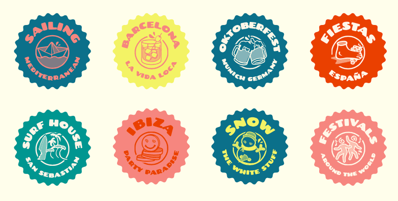
With the fresh new main colour palette we developed a suite of colours and combinations to represent our trip and destination pillars: Barcelona, Surfing, Spanish Fiestas, Sailing the Mediterranean, Ibiza, Snow, Festivals Around the World, and of course Oktoberfest.
The logo we’re going for had the working title of Yabadaba-GO as we were working with The Swords’ Bros on design – two Australian brothers who, when they’re not fronting party rock band Tropical Zombie, have churned out some seriously mind-bending concepts for surf brands and music festivals alike. We went through some weird and wonderful designs before we settled on this jazzy jitterbug script. It carries the same cool that we’ve got with our new colour combinations.
![]()
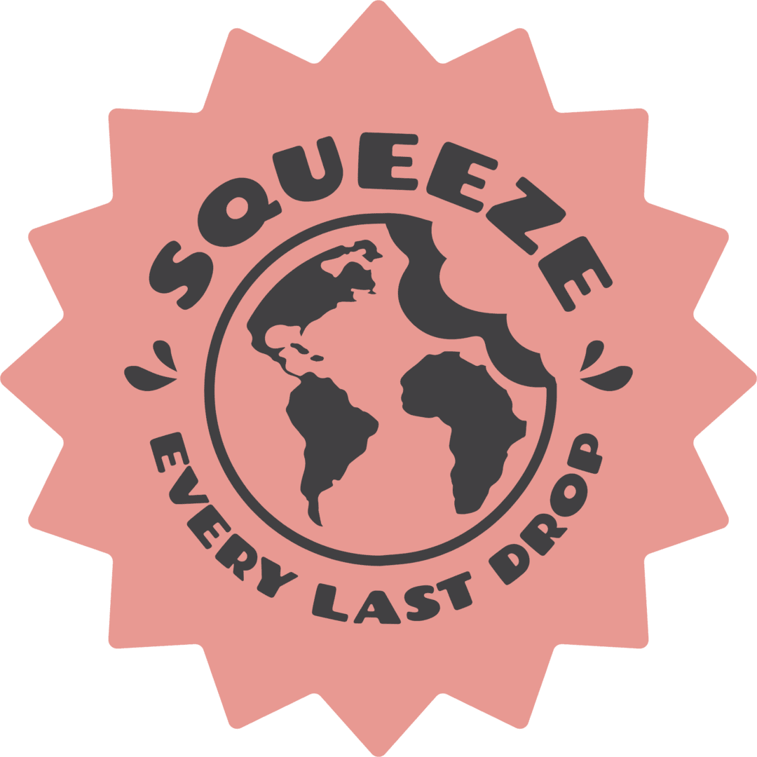
With the wordmark logo we’re making sure that the Stoke Travel name is as legible and memorable as possible by putting it at centre stage, but we’re lacking the suggestiveness of the previous pair of post-porking pig trotters. So we’ve created something more aligned with our core business – a globe with us taking a greedy, moorish bite out of Europe – and teamed it with our new main slogan, Squeeze every last drop.
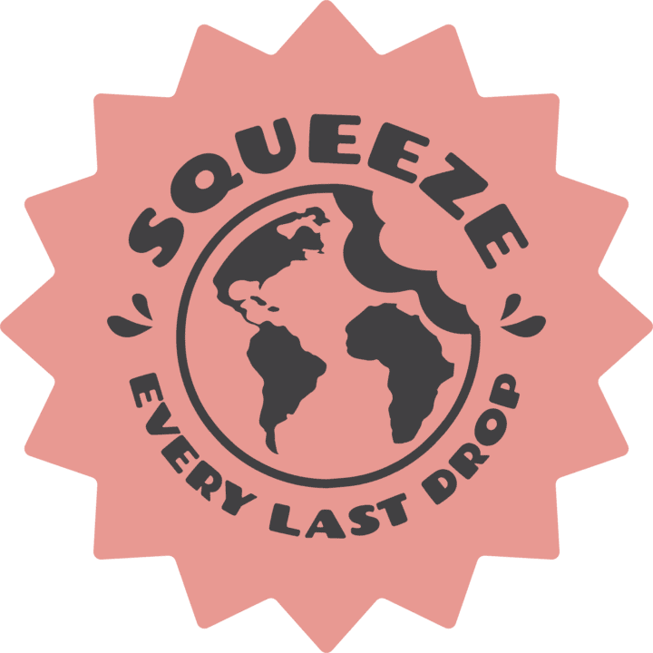
Squeeze every last drop out of your travels; squeeze every last drop out of your free time. Squeeze every last drop out of this post-pandemic life. We are fully aware that travel companies have less and less time with young travellers – and agree that it’s how it should be! Travellers now are more independent, tech savvy, have apps at their beck and call, can draw upon the boundless expanses of travel advice and experience available from bloggers and YouTubers and TikTockers and Instagrammers and probably not Facebookers.
So because we know that we are going to spend less time with young travellers we pledge to make sure that we’re squeezing as many experiences and connections into every waking moment that we have with them. That their time with us is spent meeting new and fascinating people from all over the world, experiencing Europe’s most wonderful festivals and destinations together, partying and dancing and learning and most importantly of all having as much fun as is humanly possible.
We’re drinking the juice of life and squeezing every last drop out of the bottle.
So that’s it. That’s the self-indulgent tale of where the brand has been, where it is as of today, and where it’s going. But we aren’t resting here. We never will. It’s just that we’re proud of where we are right now, how we got here, and excited to welcome a new generation of Stokies to Europe.